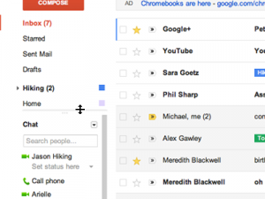
Google is releasing a permanent new look for anyone that uses Google Apps, that means you, Gmail users. For better or for worse, you may have already noticed this transition take place – especially on the Google.com homepage.
Previously, you may have seen the black navigation bar at the top of your browser window, which Google has now removed. In it’s place you will find a chunk of gray colored area reserved for search, dropdown navigation and your Google profile (including Google Plus) integration. Below that lies in store the redesign of the apps you know and love, including Gmail, Calender, Docs and Sites. But don’t fret – Google’s come a long way with their redesigns since the day their search engine was born. Most notably, the recent changes to Google Analytics were phenomenal.
Regarding looks, many links have turned into buttons and buttons have been enlarged. The color scheme is mostly grays with a focal red color used for main buttons and titles of each app, such as the “Compose” button for Gmail. Common features (like print or reply) have been more or less kept in the same place. Other changes include a lighter palette of colors for Google Calendar events. Themes are still in place but it’s uncertain if the old look will be a choice.
The real power behind this redesign is that the user can view each app at almost any screen resolution or window size, with portions of each app being re-sizable to your liking. Pictures of your contacts have also been added to give a more realistic feeling of actually being able to see who you are conversing with. And, by using the arrow dropdown from the search bar allows the user to do a myriad of things, including creating a filter using certain search criteria in Gmail or finding a type of document in Docs.
No word has been given if the mobile sites for these apps will be receiving the same treatment.
For anyone planning to acclimate themselves and any other users with this new design, Google has provided step by step instruction:
Steps to help you and your users transition to the new look:
- Use the new look now
See the Google Apps New Look site. You’ll find steps to enable the new look as well as the latest release schedule.- Communicate to your users and helpdesk staff
On the New Look site, you’ll find email templates and customizable presentations to help communicate the changes.Tip: For Gmail, use the one-time switch in the control panel to opt-in all your users, and control the timing of when they see the new look.
- Help your users get up to speed
Point your users to the Learning Center for guides, tips, and videos. Please plan to update any custom training material you’ve developed.
The release is set to hit Gmail, Docs and Sites users Tuesday, December 13th, 2011. Google Calender users will see the Calender app changed during the first part of January, 2012.
For more info and a New Look FAQ, please visit the link after the jump.